What's that? Oh, you wanted me to rate the top 64 college basketball uniforms from the past 23 seasons? Well, you're in luck, because that's what's getting ready to happen - in 16 installments. I began watching college basketball during the 1988-89 season as a 7-year old. That season ended with Michigan topping Seton Hall in the National Championship game. Given my viewing lifetime, this list only takes into consideration uniforms worn from the 1988-89 season up to the present. For the most part, the ratings are about design, color scheme, and uniqueness. I am not penalizing pre-Fab Five era uniforms for their embarrassing short shorts. Similarly, I am not penalizing current uniforms for their embarrassing capri pants. I am also ignoring the fact that water marks exist on the back of uniforms. Hopefully, that is a fad that will disappear quickly. I should also note that the same team can appear on this list more than once. In fact, 9 teams appear on the list twice, and two schools make three appearances. In other words, 11 programs make up 25 of the 64 uniforms on the list. There are no hard and fast rules. These are just my opinions. That being said, there are a few guidelines I'm trying to follow. I've also tried my best to take my rooting interests out of the equation. Uniforms that have reached iconic status get a boost in the rankings. Similarly, uniforms that were truly revolutionary - in terms of fit or design - get a boost. Where only small modifications were made to a program's uniform over time, I have included the most appealing uniform from that series. However, where significant changes have been made, multiple uniforms from the same program are eligible for inclusion. I am taking into consideration third and fourth color alternates and alternate designs. However, I am not taking into consideration throwback uniforms that were part of a team's uniform rotation, unless that throwback served as the team's primary uniform. As it is difficult to pinpoint exactly the years in which some of these uniforms were worn, I have referenced a particular uniform by school and player in an attempt to jog your memory and to give you a rough idea of the time the uniform was worn. In some cases, the player pictured is not the player named as a reference point; it's simply the best picture I could find of the uniform in question. Without further ado, RBP's 16 seeds:
64) Memphis (Tyreke Evans)
Memphis currently wears uniforms that are almost identical to these, save for the addition of stripes on the shoulders, down the sides, and on the shorts.


 63) Clemson (Trevor Booker)
Clemson's otherwise average uniforms make the cut on the strength of their purple alternates.


 62) Utah (David Foster)
Like the throwback jersey look but not a fan of the shorts, which read "U - US - MUSS", a reference to the team motto (the MUSS being the Utah student section).


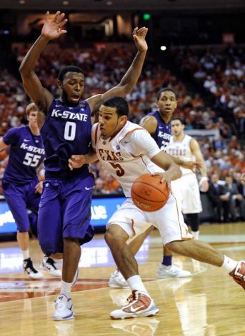
 61) Kansas State (Jacob Pullen)
The white and black versions are fantastic, but the purple and gray models drag the Wildcats down.


Good start. But I take issue with the Kansas State pick. I actually prefer the purples and grays to the blacks and whites, and overall, I'm not a fan of the jerseys at all. The verbiage ("K-STATE") across the chest and the font make them look generic, like a mid-budget movie who didn't pay to use real teams and have squads with mascots like bandits and sharks.
ReplyDeleteAlso, at the end of this, I might wonder why the Utes aren't higher. Not everybody can pull off writing above and below the numbers, but the font, the color scheme, and the above/below lettering make these unis special.
I typically do not like it when a team with "State" in its name emphasizes "State" at the expense at the rest of its name. For whatever reason, the "K-State" moniker works for me, though.
ReplyDeleteA note on gray unis - I guess you've noticed that seemingly everyone is jumping on the gray bandwagon this year. My take is that if you're not Georgetown, you probably shouldn't be wearing gray. I give a pass to teams that have gray or silver in their color scheme. Also, if you're going to gray, dark gray is the way to go. Unfortunately, most of teams adopting the gray look this season have chosen a washed out gray that is hard to look at.
I agree that not every jersey pulls off the writing above and below the number look. It can make a jersey look really cluttered. But when it works, it looks great.
FInally, I should note that Clemson made the list despite the handlbars/horns near the uniform's shoulders. That was a pretty ubiquitous look a couple of years back.